Brief: a writer's site
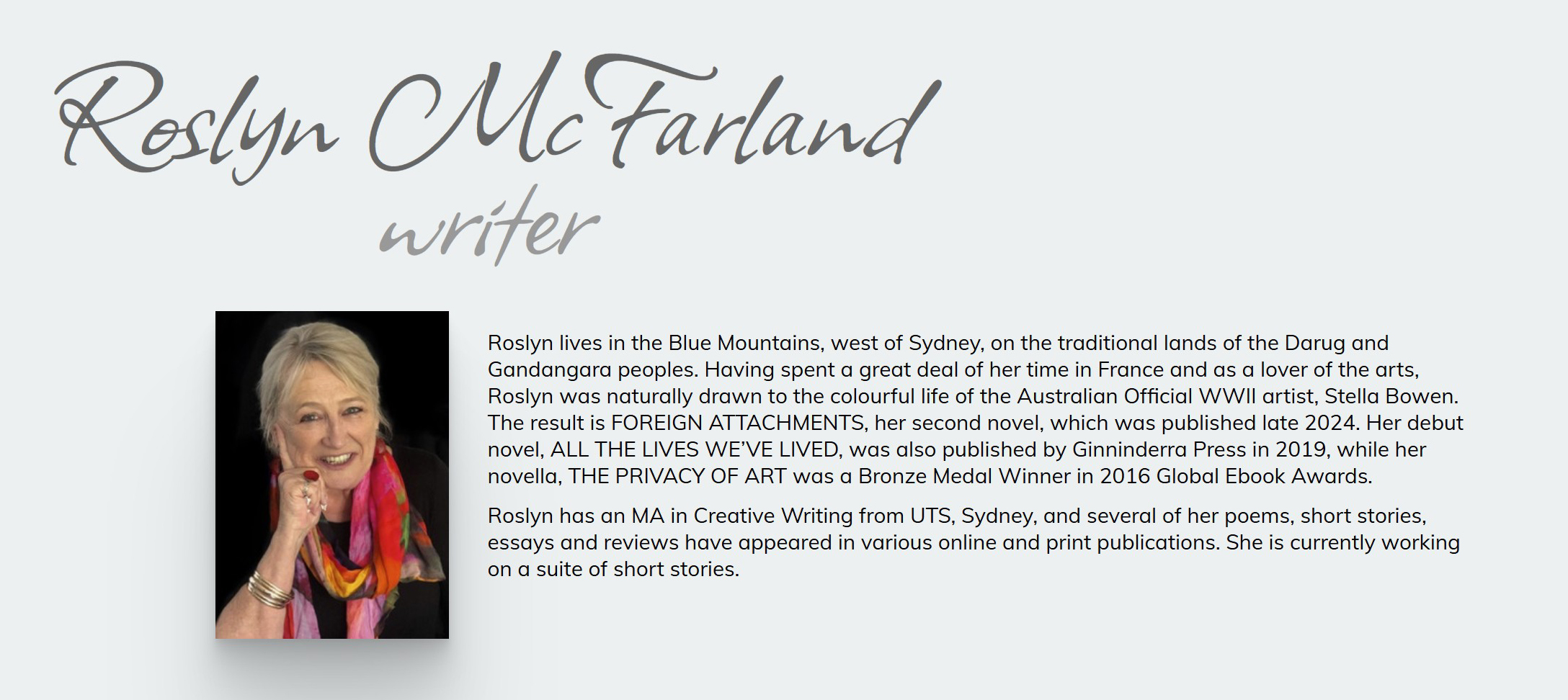
Writer Roslyn McFarland had a new novel published – time for website to showcase her work. The site includes reviews of her novels, poems, and a reading on YouTube.
Work carried out:
- Design a one-page responsive website
- Choose typefaces and site colours
- Build hand-coded flat-file custom website
- Test and upload
Visit the website home page: roslynmcfarland.com
Brief: an informational site
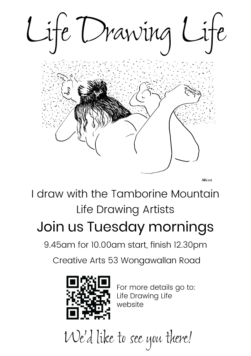
I have set this site up as an information page for our local life drawing group. I do have plans to develop it further in the future, but for the moment it displays basic information and contact details. The image below is a poster which I designed for local distribution.
Work carried out:
- Design a one-page responsive website
- Choose typefaces and site colours
- Choose one of my drawings drawings to display on the site
- Build hand-coded flat-file custom website
- Design logo
- Test and upload
Visit the website home page: lifedrawing.life
Brief: a product showcase site & logo
Scruffie Marine needed a responsive site with a clear and simple pathway to each product. The logo needed to be cleaned up and updated.
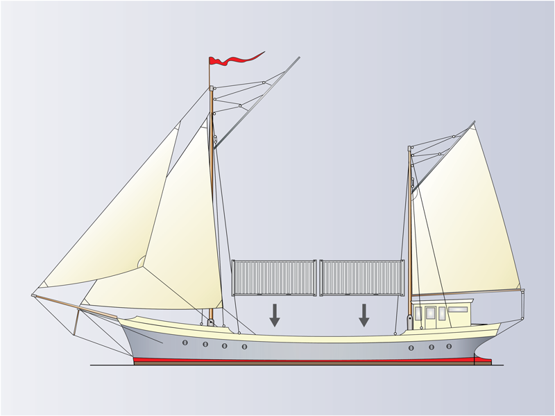
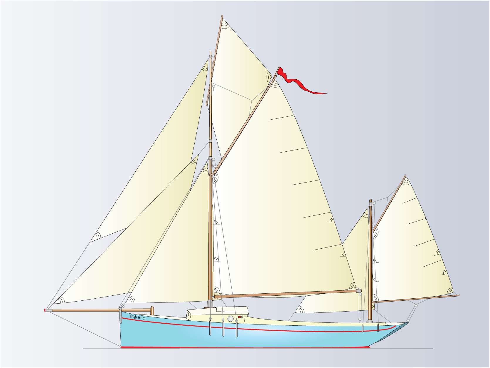
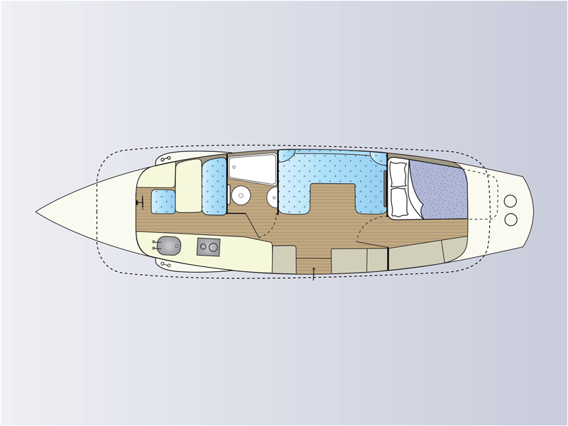
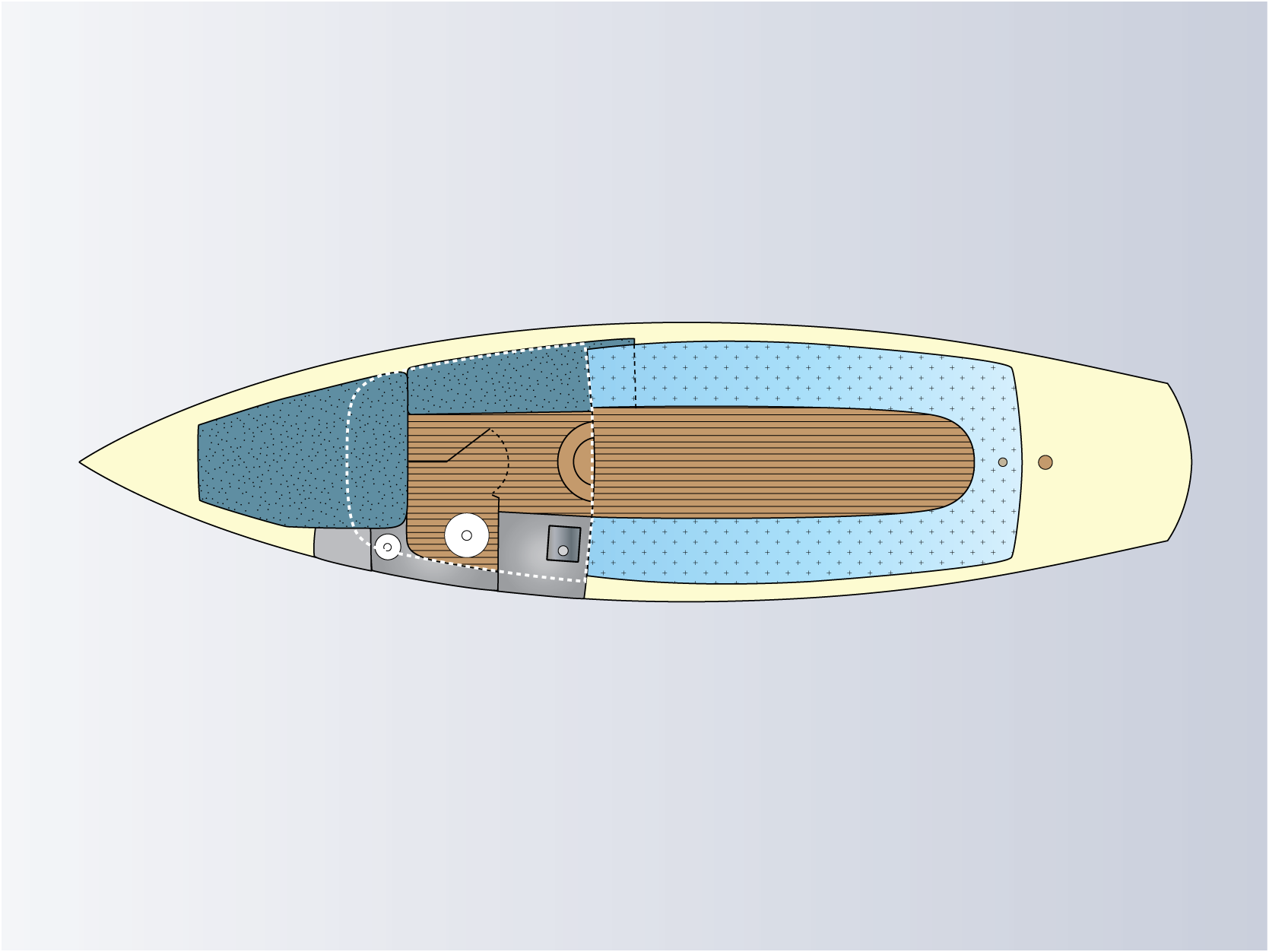
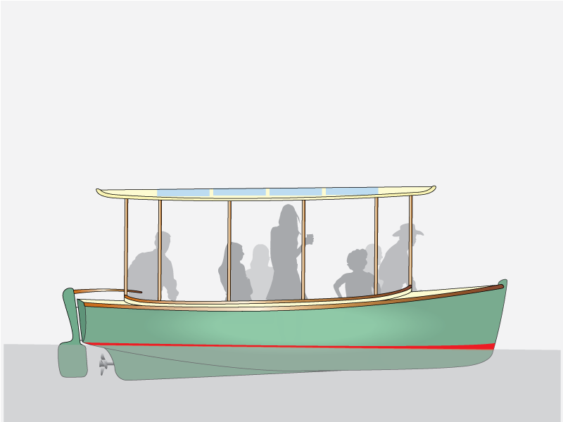
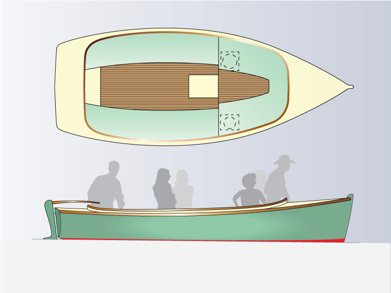
While the Scruffie Marine site is rich with high quality photos of completed boats, the site also required polished drawings of new boats under development.
The slides below show the new logo, and informative drawings I have created for new products.
Work carried out:
- Logo re-design
- Create product drawings
- Optimise photos
- Embed videos
- Choose typefaces and site colours
- Responsive website design
- Build hand-coded flat-file custom website
- Test and upload
Visit the website home page: scruffie.com
Brief: a product showcase site
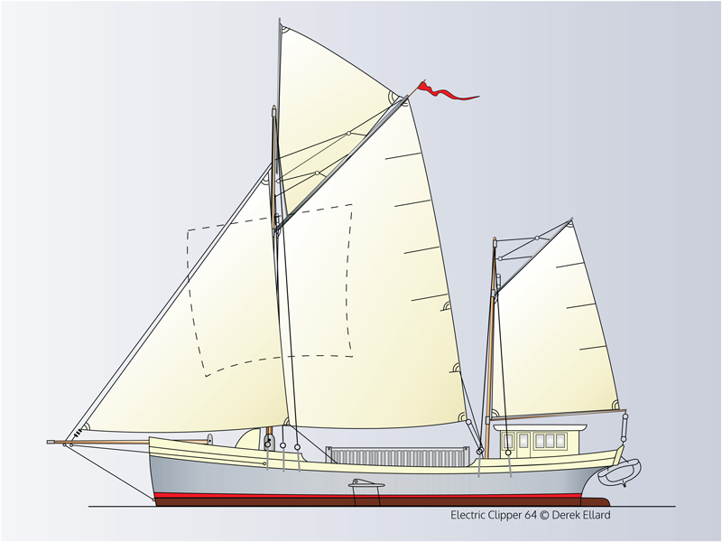
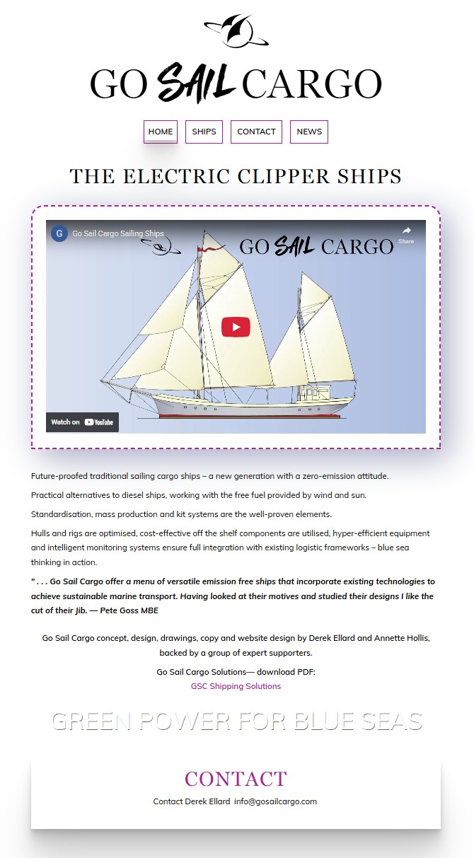
While it’s great to launch a fully completed new website, sometimes it is appropriate to build in stages. While the client finalised his product details and specifications the Go Sail Cargo site remained as a simple one-page site displaying concept and contacts. Now with multiple pages, the site will grow as required. Fast forward to 2023, Go Sail Cargo now has a new logo. Previously using the Scruffie Marine logo, she is now in the same "family" but proudly displaying her own identity.
Work carried out:
- Design a one-page responsive website
- Develop one-page site into a multi-page site
- Choose typefaces and site colours
- Create drawings of product designs
- Build hand-coded flat-file custom website
- Test and upload
- Design new logo
Visit the website home page: gosailcargo.com
Brief: a professional services site and logo
The BB Professional Services website is a responsive ten-page website with a unique layout, and as always with my websites, designed around the content rather than bending the content to suit a template. It is a unique expression of my interaction with my client and was a very positive experience for both of us and I am very happy to report that my client found me “easy to work with” and that she found “the development process was good for me.” This is what it’s about – getting to the heart of the matter, finding rapport and jointly bringing the project to successful completion.
As for appearance and usability, my client says:
“I love the style, which is sleekly attractive, but never over-decorative or gimmicky.”
“An overwhelming quantity of content was made manageable.”
"It is vastly better than I could have imagined."
“All feedback about the site has been that it is easy to navigate as well as stylish.”
As part of the job I redesigned the logo which had been created many years ago. Certain elements were retained for continuity — the idea of two B letters facing each other and the boxy profile, however it was completely rejuvenated and enlivened, so now has a brand new look and works well at any scale.
Work carried out:
- Re-design logo and create files for website
- Design website to suit client requirements
- Build responsive website to suit information supplied
- Choose colour scheme
- Choose typefaces
- Crop and optimise photo for web
- Guide client with meta data description requirements for good SEO
- Install SSL certificate
- Conduct website testing
- Conduct user testing
- Organise SSL certificate, domain name registration, and web hosting
Visit the website home page: www.bbps.com.au
Brief: a website designer's site & logo
My own website has been kept minimal and clean.
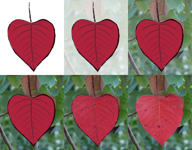
The tightly structured logo design and the hand drawn leaf motif are related by colour
and the diagonal lines. While they sit happily together each tells its own story . . .
The logo with its triangular upper form represents the roof of a house and so the 'home' of a website.
It also represents a mountain — the beautiful rainforest mountain where I live.
The leaf motif has been taken from the plant Homalanthus populifolius, known as ‘Bleeding Heart’ which has self-seeded
near my front door. An Australian rainforest plant, it is a pioneer species, robust and very beautiful — just what I aim
for in a website. The arrow represents precise targeting and, of course, Cupid's arrow of passion — two important
elements in a project.
Work carried out:
- Logo design
- Create image— leaf motif
- Animated GIF
- Choose typefaces
- Responsive website design
- Build hand-coded flat-file custom website
- Test and upload
Visit the website home page: www.annettehollis.com
Brief: a product & service site
Robert wanted a site to showcase his restored and unrestored original Klaxon horns and offer his expert repair services.
A well known figure in the world of swap-meets, I correctly guessed his 'handle' was 'The Klaxon Man' and designed the
site around that. Robert quickly came up with a very interesting short piece about the origins and development of his 'long time passion' and I combined a
photo of his face with a background filled with his original old horns — identity now established!
I designed a one-page site with various sections that could be accessed either by scrolling or via the menu links at the top
of the page. As well, a 'return-to-top' button was installed to assist navigation. Robert can update the two photo slide shows and
news section himself without ever touching the carefully coded single page that is displayed to the site visitor. I set up a
separate (unpublished) page for Robert to write up his news which is automatically fed to the viewable site page — the result is stress-free updating!
I intentionally chose a theme that was light in weight for faster loading, particularly important as I was adding the two slide shows and a large image.
The option to use Google Fonts was also important and I further tweaked the font styling and mobile display in an extra style sheet.
Work carried out:
- Design a one-page responsive Wordpress website
- Choose a theme to suit my design and code an extra style sheet
- Choose typefaces and site colours
- Choose suitable slide-show plug-in and install
- Photo manipulation
- Build locally and test
- Test and upload
Visit the website home page: www.klaxonhorns.com
Brief: a product showcase site
This site displays a single product, a solar-electric ferry.
Work carried out:
- Choose typefaces and site colours
- Optimise photos
- Embed video
- Responsive website design
- Build hand-coded flat-file custom website
- Test and upload
Visit the website home page: electricferry.com.au
